NOVO NORDISK
GLOBAL TRAINING COLLABORATION WEBSITE
THE WEB STORY
As part of the strategic team, and lead designer for Novo Nordisk's Global Training Collaboration. I designed and structured an internal website for multiple internal groups to communicate and collaborate on a Microsoft SharePoint platform. This new intranet would allow several regions, across the world, to work on multiple projects, provide have a depository for templates, images, and other shared documents.
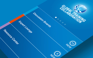
Check out the Mobile App Here!
THE CHALLENGE
Creating a solution for any project is always exciting. The main goal with this intranet was to facilitate a system for regions in China, Japan, Europe, Canada, United States, and other parts of the globe to work together. What was then a job of one administrator to distribute and gather any and all documents requested, it was now the task of the website to be a reliable place to store and place all documents.
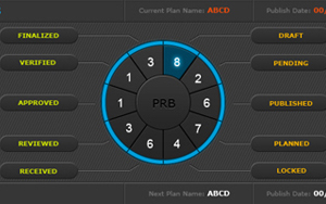
Secondary goals were also set; A blog system was imagine for all collaborators to discuss and expand on work topics. Ideas would be encouraged to share amongst the community to help make the working system more streamline. A Q&&A system was also devised so members could "Ask an Experts" any question that they may have. These along with a calendar and a directory would make up this new intranet.
THE WIRES
Extensive research and trials was done to help construct the wireframing for the GTC site. A site map was also created to help us with the U.X.
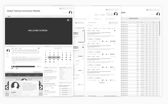
OUTLINING PAGE COMPONENTS
I go through numerous amount of component reviews, trying figuring out the most helpful set-up for the majority of end-users. Figuring out the hierarchy of the information is extremely important.
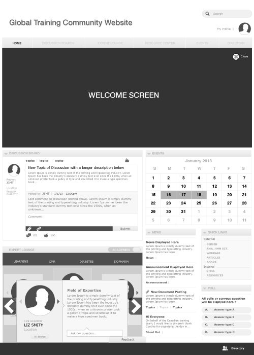
THINKING VISUALLY
Once I have established the distribution of all content, the hierarchy of information, and the components necessary - I take on the visual creative portion of the project. The visual part of this process helps finalize the logistics of the U.X and U.I. - This is where the magic happens.
EXPLORATION PROCESS
Sometimes, it is not until the colors are introduced that you get a clear idea of what is ACTUALLY necessary. This is what I helped the group at Novo Nordisk figure out. We went thru several revisions and layouts, trying to get the necessary information on the home page with out cluttering the space. As you can see, style is also a big factor on how much information can be introduced without overwhelming the user.
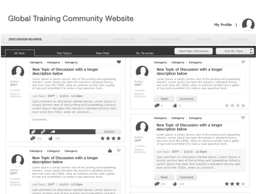
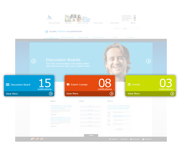
FUNCTIONAL COMPONENTS
We adopted a Metro (Windows 7) approach to these notification widgets. These widgets inform the user on what post others have contributed since he last participated on them.
PROMOTIONAL CAROUSEL
These banners make sure to highlight and keep users and all the important events. Banners and background color change to compliment information displayed.

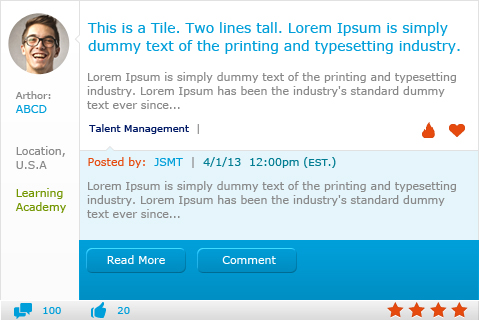
POST ENTRY
Tiles with tons of function. At a glance you can see your the original post, the last response, how many comments it has received, amount of likes given, your rating, and several other key information. All neatly positioned.
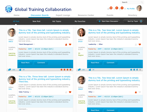
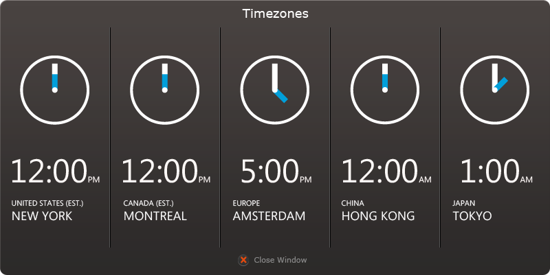
TIMEZONE CLOCKS
With so many contributors all over the world working together, it can sometimes get confusing at what time something happened or is supposed to happen. These clocks helps figure a few things out.
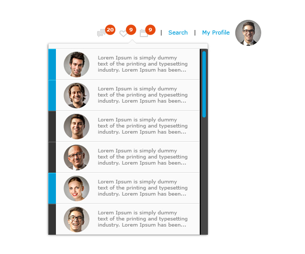
UPDATE NOTIFICATIONS
A quick view of all the notification each user accumulates around the site. Color tabs help figure out which section each notification is associated with.
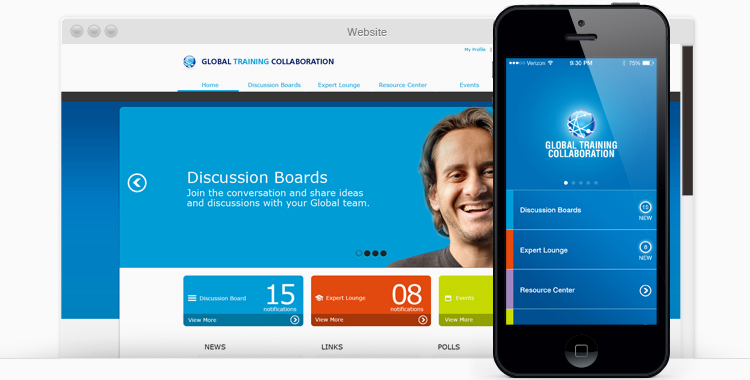
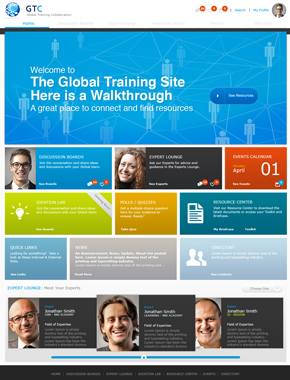
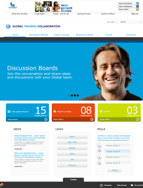
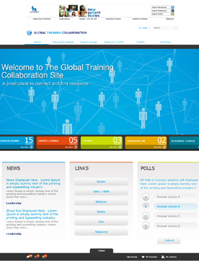
FINAL SOLUTION
After a long productive journey, we come to the finalization of this collaborative website. Here are just three pages of the final project; Home page, Discussion Boards and the Experts Lounge.